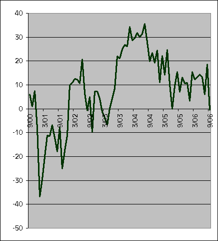
The bulls are charging in the Treasury market after the Philly Fed index gave its worst showing in 3+ years. I rarely post graphs of historical economic data, but I was curious myself, so here it is.
The number is so poor, and so far off the previous, that it smells a little like an aberration. From the sudden rally in Treasuries, it looks like some PM’s capitulated after seeing this number, figuring that no better entry point is coming. This isn’t the end of the capitulation trade, though, because there is still plenty of money on the sidelines. That “sidelines” cash is exactly what keeps me from actually being short duration here.
The Philly Fed figure is a survey (methodology piece here), and I hate surveys as economic indicators. I believe in the adage that actions speak louder than words, and a survey is just words, whereas we can observe the actions of various economic agents directly. The Philly Fed’s survey is done as a diffusion index where the respondent is asked to simply answer whether various measures of business activity will be higher, lower, or about the same. I think that method is better than most, but still imperfect. I’d rather just look at what actual factor orders are rather than what people in the Philly Fed region think they will be.
Technorati:
Bonds, Federal Reserve, Philadelphia Fed
Thursday, September 21, 2006
Filthy
Subscribe to:
Post Comments (Atom)


No comments:
Post a Comment